Controls
A form Control is a UI interface for the user to interact with the application.
Bellow we can find the description of all the Controls implemented in the PyForms library.
ControlBase
All the Controls inherit from this Control, therefore you can find its functions and properties in all the other controls listed below.
Constructer
__init__(label='', default='', helptext='')
label - Control label.
default - Initial value of the control.
helptext - Text shown when the mouse is over the control.
Functions
init_form()
Load the control UI and initiate all the events.
load_form(data, path=None)
Loads the value of the control.
data - It is a dictionary with the required information to load the control.
path - Optional parameter that can be used to save the data.
save_form(data, path=None)
Save a value of the control to a dictionary.
data - Dictionary where the control value should be saved.
path - Optional parameter that can be used to load the data.
show()
Show the control.
hide()
Hide the control.
add_popup_menu_option(label, function_action=None, key=None, icon=None, submenu=None)
Add an option to the Control popup menu.
label - Label of the option
function_action - Optional parameter that can be used to load the data.
key - Dictionary where the control value should be saved.
icon - Optional parameter that can be used to load the data.
submenu - Parent submenu to which the option should be added. If no value is set, then the option will be added to the main popup menu.
add_popup_submenu(label, submenu=None)
It returns a new sub popup menu. If submenu is open the menu is added to the main popup menu.
control.add_popup_menu_option('option 0', function_action=self._do_something)
submenu1 = self._control.add_popup_submenu('menu 1')
submenu2 = self._control.add_popup_submenu('menu 2', submenu=submenu1)
control.add_popup_menu_option('option 1', function_action=self._do_something, key='Control+Q', submenu=submenu2)
Events
about_to_show_contextmenu_event()
Function called before the Control popup menu is opened.
changed_event()
Function called when ever the Control value is changed. The event function should return True if the data was saved with success.
Properties
enabled
Returns or set if the control is enable or disable.
form
Returns the QWidget of the control.
help
Returns or set the tip box of the control.
label
Returns or sets the label of the control.
name
This property returns or set the name of the control.
parent
Returns or set the parent basewidget where the Control is.
visible
Set and return the control visibility.
value
This property returns or set what the control should manage or store.
ControlBoundingSlider

Constructer
__init__(label="", default=[20,40], min=0, max=100, horizontal=False)
default - The default value is a list containing in the first element the lower value and in the second element the upper value.
min - Defines the minimum value that can be selected.
max - Defines the maximum value that can be selected.
horizontal - Flag indicating if the Bounding slider should be draw horizontally or vertically.
Properties
value
Gets and sets the value of the Control. This value is a list containing in the first element the lower value and in the second element the upper value.
min
Gets and sets the the minimum value that can be selected in the bounding slider.
max
Gets and sets the the maximum value that can be selected in the bounding slider.
convert_2_int
If True the control works only with Integer values. If False the control will return Float values.
ControlButton


Constructer
__init__(label='', default=None, checkable=False, helptext='')
checkable - Flag indicating if the button is checkable or not.
Functions
load_form(data, path=None)
Because the value of this Control is a function, nothing is loaded
save_form(data, path=None)
Because the value of this Control is a function, nothing is saved
click()
This function simulates a click of the button.
Properties
checked
In case the button was initiated with the flag checkable=True, it will get and set the checked state of the button.
icon
Return or set the button icon. The value should be a path to the icon or a QtGui.QIcon object.
value
The value should be a pointer to function, that will be called everytime the button is pressed.
ControlCheckBox


Properties
value
Gets and sets a boolean indicating the state of the checkbox.
ControlCheckBoxList
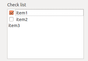
Functions
__add__(val)
Add more elements to the list. Usage:
controlVar += ('Element', True)
or
controlVar += 'Element'
clear()
Clear all the elements from the list.
Events
selection_changed_event()
Function called when the selection changed.
Properties
count
Return how many elements the list have.
checked_indexes
Returns the Elements with which have the checkboxes checked.
items
Returns a list of tuples with the format [(element, check boolean flag)]
selected_row_index
Returns the selected row index.
value
It gets and sets all the List values. This property receives a list where each element is a Row in the list.
controlVar.value = [('item1',True), ('item2',False), 'item3']
ControlCodeEditor

Events
key_pressed_event(event)
Function called when a key is pressed.
event - Qt event variable.
Properties
changed
Returns and sets the pointer to the function that is called when the button save is pressed.
lexer
Returns and sets the Scintilla lexer. By default the lexer is the QsciLexerPython.
value
Returns and sets the code text.
ControlCombo


Functions
add_item(text, value=None)
Add an item to the ComboBox. Items may have a value associated to it.
controlVar.add_item('Portugal', 'pt')
controlVar.add_item('Angola', 'ao')
controlVar.add_item('Moçambique', 'mz')
controlVar.add_item('Brazil')
controlVar.add_item('Cabo Verde')
clear()
Clear all the items of the ComboBox.
count()
Return the number o items in the combobox.
get_item_index_by_name(item_name)
Search the index of an item by the name.
__add__(value)
The same of add_item function.
controlVar += ('Portugal', 'pt')
controlVar += ('Angola', 'ao')
controlVar += ('Moçambique', 'mz')
controlVar += 'Brazil'
controlVar += 'Cabo Verde'
Events
activated_event(index)
Called when the user select an item in the combobox. index - Activated item's index.
current_index_changed_event(index)
Called when the current combobox index is changed. index - current selected index.
edittext_changed_event(text)
Called when the text is changed. text - changed text.
highlighted_event(index)
Called when the user passes with the mouse over an item in the combobox. index - highlighted item's index.
Properties
current_index
Returns and sets the selected index.
items
Returns all the items of the combobox.
value
It returns the selected value of the combo box.
text
Gets and set the current selected item text.
ControlDir


This control is used to select a directory.
Functions
click()
Simulates the push of the button.
ControlDockWidget
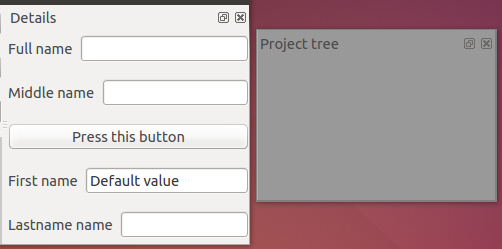
This control is used to create DockWidget.
Constructer
__init__(label='', default=None, side='left', order=0, margin=0)
side - Side where the dock widget should be initiated. It can assumes the values: left, right, top or bottom. order - Top-left order that the dock will assume in the application window. margin - Margin of the dock.
ControlEmptyWidget
This Control may be used to display a BaseWidget or another Control inside.
Constructer
__init__(label='')
The constructer receives only a label.
Properties
value
It may receive an element, or a list of elements from the types BaseWidget or BaseControl.
ControlEventTimeline
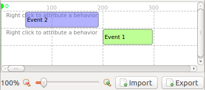
This control implements a timeline where it is possible to display events and graphs.
Constructor
__init__(label="", default=0, max=100)
default - Default position of the pointer. min - Timeline start. max - Timeline end.
Functions
add_event(value, row=0, color=None)
Add a new a new event.
value - Event description. The format is a tuple: ('event name', start, end) row - Row where the event will be display. color - Color of the event.
add_graph(name, data)
Add a new graph.
name - Graph name. data - [(frame index, value), ...] list.
import_graph_file(filename, separator=';', ignore_rows=0)
Import a graph csv file.
filename - Filename to load. separator - CSV separator character. ignore_rows - Ignore the first n lines when loading the file.
import_csv(csvfile)
Import an event file from a csv.reader cursor.
csvfile - csv.reader cursor.
csvfile = open(filename, 'U')
spamreader = csv.reader(csvfile)

control.import_csv(spamreader)
show_graphs_properties()
Shows the graphs properties window.
Events
pointer_changed_event()
Shows the graphs properties window.
Properties
value
Returns the events list.
max
Returns or sets the maximum of time that the control will handle.
mouse_over_row_index
Returns the index of the row which the mouse is over.
rows
Returns a list of rows objects.
graphs
Returns a list of graphs objects.
ControlFile


The control may be used to select a file.
Constructer
__init__(label='', default='', helptext='', use_save_dialog=False)
use_save_dialog - By default the control will select a file to be opened. If this flab is True The control will open a file to be created or updated.
Functions
click()
Simulates the push of the button.
Properties
value
Gets and sets a file path.
ControlImage


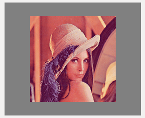
Displays an image or a list of images.
Functions
repaint()
Redraw the image or set of images
Properties
value
This property receives an image path, a numpy image or a list of numpy images.
Usage:
controlVar.value = 'lena_color.png'
or
controlVar.value = cv2.imread('lena_color.png', 1)
or
img1 = cv2.imread('lena_color.png', 1)
img2 = cv2.imread('lena_color.png', 1)
controlVar.value = [img1, img2]
Note: the value can only be set outside the constructor and the init_form function.
ControlLabel

Displays a text.
ControlList
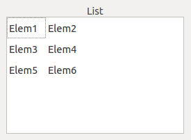
Displays a list of values.
Constructer
__init__(label="", default="", add_function=None, remove_function=None)
add_function - Function called when the add button is pressed. remove_function - Function called when the remove button is pressed.
Functions
clear()
Clear all the values from the list.
__add__(values) source code
Inserts a new row with the list of values. Notes: - It is possible to use a QWidget value. - If the value has the attribute icon, this icon will be displayed.
__sub__(index)
Removes the row with the index.
set_value(column, row, value)
Set the value of a specific cell.
get_value(column, row) source code
Get the value of a specific cell.
resize_rows_contents()
Auto resize the rows acording to the content.
get_currentrow_value()
Get the current row values.
get_cell(column, row)
Returns the a specific cell from the QTableWidget.
Events
data_changed_event(row, col, item)
Called when any of content of the list is updated.
item_selection_changed_event()
Called when ever the selection changes.
current_cell_changed_event(next_row, next_col, previous_row, previous_col)
Called when a new cell is selected.
current_item_changed_event(current, previous)
Called when the item select changed.
cell_double_clicked_event(row, column)
Called on item item double click.
Properties
autoscroll
Returns and sets the autoscroll flag. If True the ControlList will position the scroll automatically to a position where the new new added item will be visible.
horizontal_headers
Get and set the horizontal headers in the table list.
word_wrap
Get and set the word wrap.
rows_count
Returns the number of rows.
columns_count
Returns the number of columns.
select_entire_row
Accepts a boolean indicating if should allow only the selection of the entire row or not.
value
Get and set a list of values.
selected_rows_indexes
Return the selected indexes.
selected_row_index
Return the selected index.
icon_size
Gets and sets the icon size.
readonly
Returns and sets the readonly flag for the control.
ControlMatplotlib

Functions
draw()
Draw the graph.
Properties
value
Sets and gets a function called to draw the graph. This functions receives a matplotlib figure as parameter.
Usage:
def on_draw(figure:
    x = range(len(self.value))

    axes = figure.add_subplot(111, projection='3d')
    axes.clear();
    pts = axes.scatter(x, x, x, c=x)
    figure.colorbar(pts)


obj.value = on_draw
ControlMdiArea
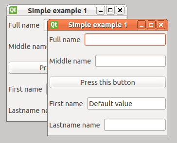
Constructor
__init__(label='')
The constructer receives only a label.
Functions
__add__(other)
Add a basewidget to the mdi area.
Usage:
controlVar += baseWidget
__sub__(other)
Remove a basewidget from the mdi area.
Usage:
controlVar -= baseWidget
Properties
show_subwin_close_button
Boolean flag, indicating if should show the subwindows close button or not.
ControlNumber

Constructor
__init__(label="", default=0, min=0, max=100)
min - Defines the minimum value that can be selected. max - Defines the maximum value that can be selected.
Properties
min
Defines the minimum value that can be selected.
max
Defines the maximum value that can be selected.
value
Returns the selected number.
decimals
Returns and sets the number of allowed decimals.
ControlOpenGL
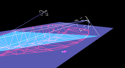
Functions
repaint()
Refresh the GL scene.
reset_zoom_and_rotation()
Reset all the zoom and scene rotations.
Properties
value
Gets and sets a GL scene.
width
Gets the GL window width.
height
Gets the GL window height.
clear_color
Returns and sets the background color.
ControlPlayer


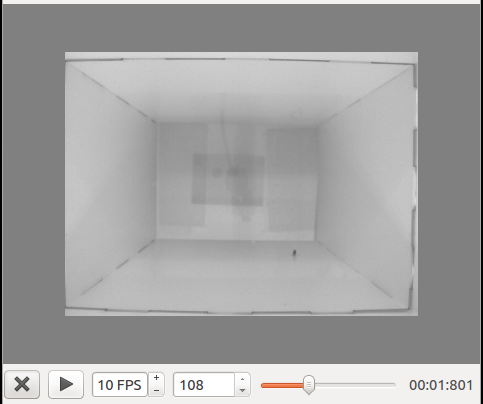
Functions
play()
Plays the video.
stop()
Stops the video.
refresh()
Refresh the last painted frame.
update_frame()
Read the next frame and display it.
Events
double_click_event(event, x, y)
Called on double click
event - Qt event. x - Mouse x coordenate in the video. y - Mouse y coordenate in the video.
click_event(event, x, y)
Called on when the mouse click is activated.
event - Qt event. x - Mouse x coordenate in the video. y - Mouse y coordenate in the video.
drag_event(start_point, end_point)
Called everytime the mouse is dragging in the video.
start_point - Drag starting point. end_point - Drag end point.
end_drag_event(start_point, end_point)
Called when the mouse ends dragging the video.
start_point - Drag starting point. end_point - Drag end point.
key_release_event(event)
Called everytime a key is pressed.
event - Qt key event.
process_frame_event(frame)
Function called before the frame is rendered. It should return a frame or a list of frames.
frame - Numpy array representing the image.
Properties
value
When not None, it returns a cv2.VideoCapture object.
It may receives a video file path, or a cv2.VideoCapture object.
Usage:
controlVar.value = '~/home/ricardo/video.avi'
or
controlVar.value = cv2.VideoCapture('~/home/ricardo/video.avi')
next_frame_step
Sets and gets the number of flags that should be jumped on the next cycle.
view_in_3D
Activates the 3D visualization mode. It can be usefull to produce some 3D data visualization.
video_index
Returns the current frame index.
max
Returns the total number of frames of a video.
frame
Returns and sets the frame image that is beeing rendered.
fps
Returns and sets the video FPS.
help_text
Return and set the help text that should be rendered in the video.
frame_width
Width of the frame that is being displayed
frame_height
Height of the frame that is being displayed
is_playing
Returns True if the player is playing.
ControlProgress


Constructor
__init__(label="%p%", default=0, min=0, max=100)
label - This is the text that will be shown in the ProgressBar.
min - Defines the minimum value that can be selected.
max - Defines the maximum value that can be selected.
Functions
__add__(other)
Increments the progress.
__sub__(other)
Reduce the progress.
Properties
min
Defines the minimum value that can be selected.
max
Defines the maximum value that can be selected.
value
Current position.
ControlSlider


Constructor
__init__(label="", default=0, min=0, max=100)
min - Defines the minimum value that can be selected.
max - Defines the maximum value that can be selected.
Properties
min
Defines the minimum value that can be selected.
max
Defines the maximum value that can be selected.
ControlText


Events
key_pressed_event(event)
Event called everytime a key is pressed.
ControlTextArea
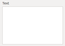
Functions
__add__(other)
Append text to the bottom.
Properties
readonly
Returns and sets the readonly flag for the control.
autoscroll
Returns and sets the autoscroll flag. If True the ControlTextArea will scroll always the text to the bottom everytime a new text is added.
ControlToolBox
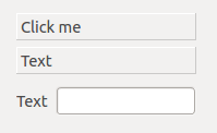
set_item_enabled(index, enabled)
Enable or disable an item
is_item_enabled(index)
Check if an item is enabled or disabled
Properties
value
It returns and receives a list of BaseWidgets.
ControlTree
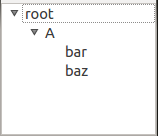
Functions
__add__(other)
Add an item to the root node.
__sub__(other)
Remove an item from the root node.
add_popup_menu_option(label='', function_action=None, key=None, item=None, icon=None, submenu=None)
Add a popup menu option to all the items, or a specific item.
label - Label of the menu option. function_action - Function to be called when the option is selected. key - Option hotkey. item - Item to which the popup menu option should be applied. icon - Icon of the popup menu option. submenu - Submenu where the option will be added.
clear()
Clear all the items from the ControlTree.
expand_item(item, expand=True, parents=True)
Expand or close an item and their parents.
item - Option hotkey. expand - Flag indicating if the item should be expanded or closed. parents - Flag indicating if the parents of the item should be expanded or closed.
create_child(name, parent=None, icon=None)
Create a new child item.
name - Name of the new item. parent - Parent item of the new item. icon - Icon of the new item.
To the return item it is possible to associate the events:
item = control.create_child('new item')
item.key_pressed_event = self.__key_pressed_event
item.double_clicked_event = self.__double_clicked_event

def __key_pressed_event(self, event): pass
def __double_clicked_event(self): pass
clone_tree(tree, copy_function=None)
Clone the items of a ControlTree.
tree - ControlTree to clone. copy_function - Function with the arguments "copy_function(item, new_item)" and will be called everytime a new tree item is created.
clone_item(parent, item, copy_function=None)
Clone an item.
parent - Parent to add the clone. item - QTreeWidgetItem to clone. copy_function - Function with the arguments "copy_function(item, new_item)" and will be called everytime a new tree item is created.
item.key_pressed_event(event)
Called when the item is selected and a key is pressed.
item.double_clicked_event()
Called when an item is double clicked.
Events
item_changed_event(item)
Called everytime an item is updated.
item - Updated item.
item_selection_changed_event()
Called when ever a new item is selected.
item_double_clicked_event(item)
Called an item is double clicked by the mouse.
item - The item that was double clicked.
key_press_event(event)
Called when a key is pressed.
event - Qt event.
rows_inserted_event(parent, start, end )
Called when new items are inserted.
parent - Parent to which the rows were inserted. start - Insertion starting row. end - Insertion ending row.
Properties
show_header
Flag that shows or hide the header.
selected_rows_indexes
Retrieve the selected rows.
selected_row_index
Retrive and set the selected row.
selected_item
Retrive and set the selected item.
icon_size
Returns and sets the items icons size.
ControlVisVis
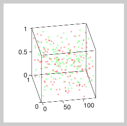
Functions
refresh()
Repaint the points
Properties
value
Gets and sets a list of 2D or 3D points to display.
legend
Set the graph legend
show_grid
(True or False). Show a grid in the graph
title
Set the graph title
xlabel
Set the x axis label.
ylabel
Set the y axis label.
zlabel
Set the z axis label.
ControlVisVisVolume
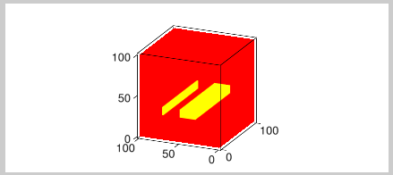
Functions
refresh()
Repaint the image.
Properties
value
Gets and sets an numpy array image with volume.
colors_limits
Gets and sets the colors limits.
visvis
Return the visvis object.
color_map
Gets and sets the color map to display.
It can receives the next values: CM_BONE, CM_COOL, CM_COPPER, CM_GRAY, CM_HOT, CM_HSV, CM_JET, CM_PINK, CM_AUTUMN, CM_SPRING, CM_SUMMER, CM_WINTER.
Check out VisVis documentation.
ControlWeb

Displays a web-browser.
Properties
value
Gets and sets the URL of the page to load.
